Showing posts with label art instruction. Show all posts

Tuesday, July 14, 2020

Blind Contour Drawing

Contour drawing was first taught at the Art Student’s League in New York by Kimon Nicolaïdes in the 1920s and 30s. He used it and other exercises as a way to train his students to observe their subjects more closely. His methods are still being taught in art schools today. 

Blind contour drawing involves carefully observing the outline and shapes of a subject while slowly drawing its contours in a continuous line without looking at the paper. By doing so, you are forced to draw what you actually see instead of what you think you see.
Blind Contour Drawing Exercise

You should definitely try this! If you do, please send me a photo of your results, including a photo of your subject. Let me know what thoughts are running through your mind and your observations as you move your pen/pencil around the page.

For this exercise, you will need the following:
  • A pen or drawing pencil
  • A drawing pad
  • A timer
  • A simple subject. I suggest your hand, a shoe, or a grouping of fruit. Anything fairly simple will do.
  1. Place your subject at a 90 - 180-degree angle away from your forward drawing position, to the left if you are right-handed, or the right if you are left-handed. You need to be looking away from your paper.
  2. Set your timer for ten minutes.
  3. Set your pen/pencil on a point on the pad and look at one area in your subject.
  4. Begin drawing, don’t look at your drawing pad and don’t lift the pen/pencil from the pad.
  5. Go slowly. As your eyes follow the line of your subject one millimeter at a time, your pen/pencil will move at the same slow speed.
  6. Follow the outline and inner lines of your subject, including the details within the subject, changing direction, without lifting your pen/pencil. Try to follow the lines as if you were actually touching the object with your finger. Feel the item as it curves here, depresses there, and as it twists and turns.
  7. Do this without stopping until the timer goes off.
When you look at your picture, it will look like a crazy jumble of lines, but if you look closely, you will see an interesting pattern, one that includes a lot of details that you may not have realized if you had not learned to see it.


Instead of provoking anxiety, blind contour drawing is meant to help you practice your observation skills. If you approach the technique with patience, it can even be a calming exercise. Look at it as a sort of exercise in meditation. The pen goes down on the page and your eye goes to a specific point in your subject and your eye and the pen move in sync.

There’s just something about moving that slowly and that focused that makes you empty your brain of everything else. You will begin to see things differently and your skills in seeing and drawing will improve.

My effort here to do a blind contour drawing. I admit I had trouble doing this very slow and ended up redrawing the images of the carrots, so there are two sets here. I used a Pentel pen, Doing this is a great way to slow down your eyes and check shapes and relationships.

According to Nicolaïdes, “Because pictures are meant to be seen, too much emphasis (and too much dependence) is apt to be placed upon seeing. Actually, we see through the eyes, rather than with them. It is necessary to test everything you see with what you discover through the other senses – hearing, taste, smell, and touch – and their accumulated experience. If you attempt to rely on eyes alone, they can sometimes actually mislead you.”

You can read about this and a series of other drawing exercises created by Kimon Nicolaïdes in his 1941 book The Natural Way to Draw: A Working plan for Art Study.

Monday, June 29, 2020

Urban Sketching

I enjoy sketching, especially when I have a long wait, like at a doctor’s office, jury duty selection (not when the judge is in the room!), or I’m on vacation, at the beach, or at an outdoor concert. It’s fun, and you can use any type of medium, of course, the more portable the better. This type of informal sketching is commonly known as Urban Sketching.


Urban sketching sounds like you would be sketching city landscapes, but it really encompasses more than just high rises and busy streets. Urban sketching is the act of drawing while on location in areas that you live in or are traveling to.

Many artists through the years have practiced some sort of Urban Sketching. Some museums even display sketchbooks, including those by Leonardo DaVinci, Michelangelo, William Turner, John Singer Sargent, and Eugene Delacroix for example.

Sketchbooks often serve a purpose other than for pleasure. Artists would work out ideas for larger works, sometimes doing several sketches of subjects from different angles and with different combinations. Most famous artists carried some sort of sketchbook with them at all times, drawing and making notes. The sketchbook became a type of picture diary.


You can draw in almost any medium. I happen to love using Faber Castell Pitt artist pens, which are like fine-tipped markers and are easy to use, clean and very portable. They come in a huge assortment of colors and are a blast to use.

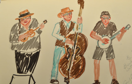
I love to go to the summer free outdoor concerts and draw the musicians and the audience. I draw quickly and keep it simple with only a few details.


I also use micro ink pens for line work. They come in different colors and different size nibs.

You can sketch at your local farmer’s market, museums, beaches, churches, picnics, parks –you name it, you can sketch it! It’s a great way to document the world you live in.


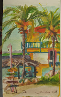
I have a watercolor sketchbook as well. It has a special paper made to absorb liquid. With a small watercolor kit, it’s a great way to do a study or capture a moment in time. And, I just discovered watercolor pencils, which are great fun and are even easier to carry. You can draw the color on the page and then use a water brush to wet the color and blend, just as you would a paint brush. 

   It doesn’t matter how good a sketcher you are. The beauty of urban sketching artwork is the informality of it. You can sketch anything, anywhere, and you don’t need to produce a finished design. You will find that your drawing accuracy will improve with practice, and so will the way that you look at things. 
 

I have several types of sketch pads in a variety of sizes, but mostly I use a soft cover moleskin sketch book, size 5”x 8” for drawing, and a hard cover moleskin, size 5” x 8” made for watercolor. The small size fits into a purse or my carry bag with my box of pens.


A great site that promotes Urban Sketching is Urban Sketchers, “an international nonprofit dedicated to fostering a global community of artists who practice on-location drawing.” The group maintains a network of blogs and online groups where urban sketchers can share their drawings and stories and interact with one another.

Next

I will share some artwork sent to me from several of you. There is some amazing work being done out there.

Class Schedules

There's no update on class schedules. For now, you can view my scheduled classes on my website, though things may change as we get closer to fall.
Stay safe and be well.

Consider Yourself Challenged! 

I know that you have been doing something fun and creative while you sip wine coolers or ice-cold beer during these warm spring days. If you've been drawing, painting, doodling, etching, coloring with crayons, sewing, knitting, embroidering, sculpting, making origami or any other type of creative art, send me a photo. You have one more week to think about it and create something. Send your photos to pmeglio99@gmail.com and I will post them in my next email.  

Tell Me What You'd Like Me to Cover

I hope you enjoyed this session of Urban Sketching. Feel free to share with others.
What would you like to see or hear more about? Which of the instructions did you enjoy the most?
Email me: pmeglio99@gmail.com or just hit reply.

Monday, June 22, 2020

Color and Reflected Light

COLOR, it’s everywhere and as long as we can see, we all experience it from the moment we open our eyes. They say that the human eye can detect around ten million hues. When we paint, we all strive to capture a small percentage of it, and often get frustrated in the process. We squeeze out luscious piles of color onto our palette in anticipation of capturing the beauty of a subject with it. Sometimes, we hit the colors on the mark. Other times, we get frustrated as we struggle through a painting when no matter what we do, we can’t seem to find the right mix. And, to make things worse, it’s not just local color, but also reflected color and the temperature of the light that we need to take into account when deciding on a shade. 

Color Choices

So, what is it about color and our color preferences that excite us? Color evokes strong emotional responses in all of us, but not necessarily the same types of responses. Blue may mean calmness and relaxation with visions of the ocean or a beautiful lake to one person, while denoting sadness to another. Depending on our life experiences, our preference for color can be psychological. For example, white might mean pleasantly clean and sterile to some who feel comfortable with a clean antiseptic environment, but cold and icy like a chilly winter day to others. Cultural traditions also influence our preference to color. If you look at color in clothing, for example, you may find that some of the cultures closest to the equator where weather is warmest tend to wear very strong, bright colors, while those in much colder climates tend to wear more subdued neutral colors.

Local and Relative Color

light creates the local color or colors of an object because each object possesses certain chemical properties or qualities that absorb some rays and reflect others How much an object absorbs and reflects determines the color of an object. However, we cannot go by local color alone. As artists, we need to put away our preconceptions about color and look at the relativity of color, i.e., the relationship of color to its surroundings. Changes to color happen when the light source changes, for example, when a sunny day (warm light) turns into a cloudy one (cool light), or when other colors that surround a subject change.

The Influence of Surrounding Colors

A subject’s colors are directly influenced by the color of objects that surround it. This color is possible because of reflected light. Reflected light helps to model form and gives variety to our shadows. A white building may take on the color of the bushes below and around it, because the light from the sky will bounce off of these objects and project on the surrounding objects.

The color of the Wadsworth Mansion in this painting was not pure white, though I’m pretty sure that if you asked the workers who painted the building what color they used, it would be some variation of white, such as titanium. The day that I painted it, the trees and flowering bushes around it projected a warm orange glow upward that originated from the sunlight that was in front of me, slightly to the left and somewhat high in the sky. There was very little direct light on the front of the building.

Reflections and Adjacent Objects

In the still life, the warm yellow of the lemon was reflected onto the cool bluish white surface, and the red skin of the apple and the peel of the orange reflect onto the normally white dish near the fruit as well as onto the fruit adjacent to them. 

Color Relationships

The six color squares are a good demonstration of the influence of surrounding colors. The orange color in the center is exactly the same for all six squares, yet depending on the color that surrounds the orange, the orange square appears to be a different shade. Note also that the stronger the color that surrounds the orange, the more it influences the perception of the orange hue. 
This is one example of how color values can draw attention to an object or provide a more subtle color shift. One color can become darker, lighter, warmer or cooler in relation to another color. When painting, try to relate and compare all of the colors in your composition to one another. Ask yourself, Is one color lighter or darker than the other? Is one color warmer or cooler than the other?


Next

I’m going to share my moleskin and small sketchbook sketches of people and places that I do for fun and practice. I'll talk about the types of media that I use when doing quick sketches.

Tuesday, June 16, 2020

Drawing Simplified, Part II: Shadows and Form

One of the basic foundations of a good drawing or painting, besides rendering the proper shape, is good form. Form turns a two-dimensional object into a three-dimensional object, and gives interest to a picture. All objects have form, some more subtle than others, depending on the light source. Shadows provide form to objects and are denoted in values. The number of values (the dark and lightness) to a form depends on the light source, how close it is and how strong it is.

Shadows

Shadows provide dimension to an object. The shadow shape is the most discernable shape of value of an object. It is opposite the light source and reveals both the form (a solid shape with volume) and plane (a flattened area of a form) of an object. 

Shadow Edges

Depending on the object, the edges of a shadow can be either sharp or soft. Observing an angular or planed object, as one plane meets another and turns away from the light, the shadow edges are sharp. For a curved object, the shadow edge is soft with a gradual shift in tone. Distance also plays a part in the edges of a shadow. If the light source is close to the object, the cast shadow is softer on the edges. As you pull the light away from an object, the cast shadow is longer and has sharper edges.

Dimension

The angle of light will affect the solidity or volume of an object. If the light is directly in front of or behind an object, the shadows on the object are not as distinct and the shape flattens. Turn the light so that it comes from the upper left or right, however, and you will see a three-dimensional view of the object, with a wider range of values. 

Cast Shadows

A cast shadow occurs when an object blocks the light and casts a shadow on a surface. It is usually a darker shadow than the shadows on the object. Changing the level of light will change the length of the cast shadows. The lower the light on the object, the longer the cast shadow. In this case, care should be taken that the shadow doesn’t become the focus of the picture, rather than the object itself. 


chiaroscuro

A term used to describe the use of light and shade in a painting or drawing, particularly when strong contrast is employed.
From the Italian for light (chiaro) and shade (oscuro).

Next

Reflections and its effect on an object’s color and light.

Friday, June 5, 2020

Drawing Simplified - Part I

I've heard time and time again, "I can't draw." or, " I can barely draw a stick figure," or, "I'm not talented enough to be able to draw." I emphatically disagree. It's not a matter of talent. Drawing, like everything else, must be learned. The thing is, more often than not, we've never been trained to draw. Think about it, in school, we were taught our alphabet, arithmetic, and grammar. We've never been taught how to draw, maybe because it was considered frivolous to know how to draw, or perhaps being creative is not considered useful.

These days, with so much going on in our lives and especially with the fear of the pandemic all around us, it's more than ever important to have a creative outlet to turn to. Art can bestow a calming feeling, and help us to cope with life's struggles. Studies have shown that creating art decreases negative emotions, reduces stress and anxiety, and can help you live longer. Creativity helps you see things differently and better deal with uncertainty. Studies show that creative people are better able to live with uncertainty because they can adapt their thinking to allow for the flow of the unknown.

So, where's the best place to start? Some people jump right into a fun medium like painting or pastels, or print making, whether from life or from a photo. However, if you don't have at least basic drawing skills and create a line and value drawing of your subject before you turn to your favorite medium, there's a good chance that you will struggle with the design and structure of your subject.

Like learning your A,B,Cs, or simple math, you need to start with the underlying structure. In most cases, it's worked out in a drawing. The best place to start with drawing is with simple shapes.

What are Simple Shapes?

Everything we see, whether from nature or man-made, can be broken down into simple shapes. These shapes include the square or cube, sphere or circle, and triangle or cone.

Before you protest that you can't draw a straight line, there are tools for that. If you can draw a straight line with a ruler, you can make a square. If you can use a compass, you can make a circle. From a square, you can make a rectangle, and, if you can draw a triangle, you can make a cone shape.
The Square A container like this tea tin, when viewed straight on, is a square.
Extending the lines of your square upward will help you to draw this canister.
           

The Circle

If you have a compass, you can make a circle. When drawing an apple, start with a circle and add the necessary curves and indents that will make up the bottom and the area of the stem.
Add the lip and handle to make this pitcher. While drawing, think about the placement and size of the negative shapes, the areas around the subject.


Use a Guide Line

Draw a straight line up the center of your shape and use it to help guide you as you draw your subject. You can measure from the line to both sides of the circle, square, or triangle to check your shape. This is especially helpful with symmetrical shapes.
The Triangle

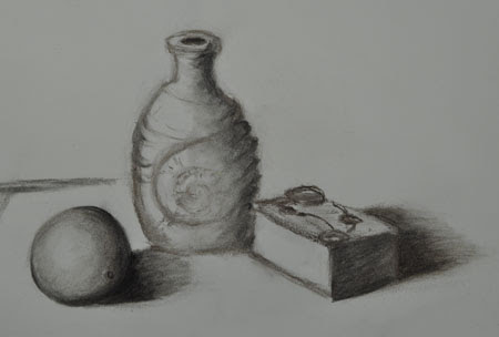
Start with a guide line in the center of this conch shell and bottle, then draw your triangle. Curve the short side of the triangle, and you have a cone shape. Do a line drawing, then add shading.
       

Measuring

Whether working from life or from a photo, it's important to check your measurements as you draw. Use your pencil or some kind of measuring device to check both length and width. Check the proportions carefully as you go. When you start with a drawing, it's a lot easier to make adjustments to both the measurements and the composition than it is to make changes in your medium.


One must always draw, draw with the eyes, when one cannot draw with a pencil 
-Balthus

Next

I'll continue with some basic drawing techniques in Part II.

Class Schedules

I'm dying to get back to teaching my classes and I know some of you can't wait to sign up.
I've updated my class schedule for the fall. It's obviously going to depend on whether and when the high schools decide to be open for Adult Ed. classes.
If Artsplace is open, I hope to schedule a class there.
For seniors, it's whether the Town of North Haven deems it safe to reopen the senior center.
For now, you can view my scheduled classes on my website.

While you're there, check out my newest additions to my artwork.

Stay safe and be well.

Tell Me What You're Doing That's Creative

I hope you enjoyed this first session of Drawing Simplified. Feel free to share with others. Please continue to send me photos of your work. I'll do another Creative Challenge in a few weeks.

I'd love to hear from you. Are you feeling inspired? What are you doing to stimulate your creative side?

Friday, May 29, 2020

Painting the Farm River - Part III

Welcome back to Painting on the Farm River. This is the final installment of this series. I hope I have inspired you to go out and paint from life nature in its beauty among the birds, butterflies, and nefarious bugs. If you've never tried it, it seems daunting, but be brave! You will learn so much by working from life, I promise.
Last week, I threw the gauntlet down, and challenged you. The response has been lukewarm and my armor is getting heavy. It would be fun for everyone to see your artistic inspirations, so you have one more week to share.

Aerial Perspective

The view from where I stood included a tree line at the farthest point of the river that stretched two to three miles. To understand how to paint objects in the distance, it is important to understand how Aerial Perspective works. Aerial Perspective is the atmospheric distance between objects in a painting. The presence in the atmosphere of moisture and tiny particles of dust and similar material causes a scattering of light as it passes through them, the degree of scattering being dependent on the wave length which corresponds to the color of the light.

Because light of short wavelength (blue light) is scattered the most, the colors of all distant dark objects tend toward blue. For example, distant mountains have a bluish cast, and yellow disappears as it recedes, followed by red.

The heavier the atmosphere, the more pronounced the effect. It is most apparent in lower elevations that commonly have higher amounts of moisture in the air. There are value changes as well. All things become cooler in color (except white) and lighter as they recede into the distance, and their edges soften. White takes on a warmer and darker shade.


"It would be impossible for me to paint slowly out of doors, even if I wanted to... There is nothing immobile in our surroundings. Water curls up all the time, clouds change shape as they change places; the rope that hangs from that boat over there swings slowly back and forth; the boy jumps; those trees bend their branches and raise them up again...But even if everything were petrified and fixed, it would be enough just for the sun to move, as it does continuously, in order to give a different appearance to things... One must paint quickly, because so much is lost, in an instant, and you never find it again!"

–Joaquin Sorolla, speaking of his time spent painting in Javea

From My View


Three hours had passed by since I began painting en plein air and the painting was starting to take shape. I’m more than ever aware of values and edges as I mixed and applied my paint.
The bushes and trees in the distance were lighter in color, and value, so I lightened them with white (a cool color) and used less yellow in the mix. The vines and trunks became a lighter red/purple. I also softened the edges quite a bit to push them into the distance.
The sky was a nice light blue, with no clouds. The sun was in front of me, overhead but not within sight. It provided some beautiful reflections on the water.
Since I began, the sun had moved and the light was beginning to change, so I stopped. When painting outdoors on a sunny day, you only have between two and three hours before the light changes, affecting the values of the subject and the length and direction of the shadows. Cloudy days are more forgiving.

I finished the painting in my studio, with the memory of the river still fresh. The blue in the water needed more emphasis, as did the moss greens, the rocks, and the lightest highlights on the water, rocks and the hemlock tree. I also darkened my shadows under the fallen trees and near the rocks. I had a photo, but only referred to it for detail information.

Next

Some photos of your artistic endeavors.

"Painting, when you feel it, is the greatest thing in the world. No, I've said it wrong, it's Nature that is beautiful."
-Joaquin Sorolla

Consider Yourself Challenged!

I can’t believe that only two of you have been working on art since the advent of this pandemic. At least, I’ve only heard from two since I’ve started this email lesson. I know there are more of you being creative during this time of seclusion, so step up to the challenge!

Hey, this armor is getting pretty uncomfortable so give me a break. If you've been drawing, painting, doodling, etching, coloring with crayons, sewing, knitting, embroidering, sculpting, making origami or any other type of creative art, send me a photo. 

Friday, April 17, 2020


Remodeling Part 1

Greetings! I hope that you are safe and in good health.

I am like everyone else trying to keep busy, stay productive and remain healthy during this health crisis. All of my classes are on hold and there's no way to tell when they will start again. I know a lot of my students are anxious to get back to class and I do miss my students and teaching.
I am not much of a remote instructor. I enjoy hands on teaching and love the interaction with my students. However, that not being possible right now, I think a lot of you would be interested in how I go about planning and executing a painting.

Most of the time, I start a painting from the beginning with a drawing, canvas prepping, transferring of the design to canvas, and then I spend a few days painting and it's done. Sometimes, though, I revisit a painting that started out okay, but then suddenly stopped dead in its tracks. Usually, I am not happy with the direction it's going and rather then go raging mad and rip the canvas apart like Cezanne often did (though I admit occasionally the thought does occur to me!), I set the painting aside and look at it now and then. I think about how I can modify and improve it. I call it "Remodeling," though I don't use a sledge hammer.

By the way, if you haven't seen the Netflix movie, Cezanne et moi, about the friendship of Paul Cezanne and Emile Zola, I highly recommend it! You can find it on Netflix.

But I digress. I started this painting about three years ago, and was unsatisfied with some parts of it, so I have been pondering over it ever since. I'm now ready to tackle it with a fresh new perspective. I thought that some of you might be interested in how I rework a painting, so I'm going to post the original artwork for this first post, and I'm going to show you how I'm planning to change it. I will send out additional emails that will show the steps that I take and will tell you the reasons for my steps.

Here it is:


The Drawing

The first step is to start with a brand-new drawing. I had some drawing paper that was the exact size of the canvas, which helped. I began working on a new design using a soft pencil and a kneaded eraser. I decided that I liked the mandolin and tambourine, so they will continue to be part of the setup. I liked the colorful fabric because it gave an interesting texture to the design but I didn't care for the white fabric and felt the small objects were lost in the design, so I discarded these. I re-positioned the tambourine and added the guitar, sheet music, and pen. The background will be very dark except toward the bottom where the fabric will be reintroduced.

It's important to note that my drawing is not just a line drawing, but also includes the dark and light areas (values) which I believe are critical to the design. If there's a nice balance of contrast, the picture will be more pleasing. This design shows a good mix of light, medium and dark values. The position of the items is also important. The eye should always be "invited" into the picture like a welcome guest and "asked to stay."


In a few days, I'll post the next step in the process. So sit back and relax. I hope you enjoy this free instruction. Perhaps it will inspire you to pick up that brush and paint a masterpiece!

Tip: Measure as you go, check accuracy by turning the canvas upside down and/or use a mirror.

Another Kind of Remodeling

Finally, I managed to get past some of the problems that prevented me from rebuilding my website. I'm happy to say that the new site is up and running. You can now view it from a computer or mobile device. I have a new Art Instruction page and a new Contact page. The dates for instruction and exhibitions are not current since I designed it before the pandemic shut things down, but I will update it when I have good dates.

I'm hoping that classes resume in late spring, but if they don't, I will be offering the same classes in painting and drawing this fall at Hamden Adult Ed, and Wallingford Adult Ed. I hope to offer classes this summer at Artsplace and continue with painting classes at the North Haven Senior Center. Stay tuned for updates.


There’s no such thing as talent. Good art takes a lot of work, a lot of hours, and a lot of patience. A good artist has earned his way.

Thursday, September 13, 2012

Don Demers Workshop in Falmouth

Don Demers held a three-day workshop in Falmouth, Mass., which is on Cape Cod, in early September. I was one of twelve people who managed to get into the workshop, which is in high demand. As soon as I heard about it, I signed up. It was a wonderful three days of painting, with lots of information and great places to paint. The Falmouth Art Association hosted the event. They have a new building that has wonderful gallery and classroom space and is large, bright and airy. Don brought samples of his work, mostly small studies of different landscapes and seascapes. He uses these studies to expand his knowledge. He turns some into larger paintings. Don spent a little time in the mornings talking about his style of painting and some of the wisdom that he garnered over the years as an artist.
Each day, we drove to a different seaside location to paint. Don would do a demo, all the while explaining his methods as he paints. I found the charcoal three-value thumbnails a great way to look for values in a view and to plan a painting. There were some things that I had seen and heard before from other artists and in other workshops, but it was great to hear them again. It helped to reinforce my thinking. I was struck by how deliberate his planning was for each painting, including how important the composition and design was. He advocates using a viewfinder and really paying attention to shapes, patterns, and rhythms.
His ocean waves demo was captivating, though the wind was pretty intense that day. His deliberate interlacing of light and dark elements was fun to watch. I highly recommend attending one of his workshops if you can.

Thursday, December 10, 2009

Things That I Remind Myself When Painting

It often seems so simple when an instructor shows me how to improve my work. They make it look so easy. What's worse is that I tell myself, "I know that, why didn't I do that?" I think that some of these things are not yet intuitive, or maybe they just are not yet ingrained in my memory. Perhaps after a few years, they will just pop to the surface.


I am starting, very, very slowly to see things that need improvement in my and other artists' painting. Still, I know that I don't always see things the way the experts see them.

Some items that I need to remind myself when painting:

  • When composing a painting, design a direction that will lead the eye into the painting and keep it there.
  • Soften edges to allow items to fade into the distance or to become less important.
  • Sharpen a few edges to pull the eye to the desired areas.
  • Use highlights sparingly.
  • Distribuite colors around the canvas rather than containing them to one area. This unifies the design.
  • Bring in background color for shadows and to help to add dimension to items.
  • Watch for curved items and remember to blend dark to light to establish three dimensions.
  • When painting leaves, use a large brush and add the color in one big swipe. Later go back and add details but keep it simple.
  • When painting reflections, especially in water, the reflected image is slightly lighter and less defined than the image being reflected.

Sunday, October 19, 2008

A Still Life Class with Jack Keledjian


On Saturday, October 18, I drove up to Putney, Vermont to take another class with Jack Kelejian. We painted a still life of apples and a white dish. There were seven other students, most of them regular followers of Jack’s. It was a chilly fall day, so we all elected to stay inside to paint.
I decided to watch Jack paint for a while instead of painting along with him. It was interesting to watch his approach, which was to put down a mix of Ultramarine Blue and Transparent Oxide Red with a large brush, in a criss-cross motion. Then, he wiped out the area for the white dish and the apples. He laid down color in solid long strokes, keeping the warm tones in the shadows and putting some juicy reds in the apples. I will continue to work on this, as my leaves need some work and maybe some more items to add to the composition. It seems empty right now. Still, I’m pleased with the progress on this painting so far.

Tuesday, June 17, 2008

Stickney Falls Paintout


I took the day off and went up to Stickney Falls in Vermont to paint with Jack Keledjian. Stickney Falls is near Putney, in a wooded area tucked away in the hills. It was a gorgeous sunny day in the 70s, and the falls were beautiful. I remember the place from taking Albert's class in the fall of last year, so I knew I was in for a wonderful treat. The class was small but nice. I got some great pointers on how to start, layout a composition, and put in a waterfall. I hope to post the painting later once I touch it up a little bit. Everyone did a great job, thanks to Jack's guidance. I also brought some paintings along for a critique, which was very helpful. Jack is a good and patient teacher. What more can you ask for?

Monday, June 16, 2008

Drawing with Paint Study


I took a drawing class with Jack (Hagop) Keledjian recently. We painted a figure with monochrome paint. I used Transparent Oxide Red, some Ultramarine Blue for the darks, and white. It was an interesting exercise. I got to concentrate on values, not color. The outline came first, then the darks, then the lighter tones, and finally I mixed in whites.

Wednesday, April 16, 2008

Class With Jack Keledjian

The class in Vermont yesterday was a lot of fun. We painted from a live model, a local girl who was very attractive. The pose was quite nice. She sat on the loveseat and posed with good arm and leg movement. My setup viewed her from a 3/4 view, which was just what I wanted. I mixed up a brown with ultramarine blue and yellow ochre, which was a bit too cool a color. I will need to get some transparent oxide brown for the next one. The first one that I did was too small for the canvas, so I restarted it, with Jack's help. The second one came out much better. I will need to use some charcoal next time to draw out the model before I paint, I think. Using one color to paint is an interesting approach. A lot of people went on to color, but I kind of liked using the one color with white. The class was small, but nice. I hope to take another one soon, possibly in May. It's nice to be back in a classroom again. I really miss listening to the ramble and art talk, and also seeing what others are doing. Publish Post

Monday, April 14, 2008

Class in Putney, VT

Finally, they are going ahead with the Drawing with a Brush class at Village Arts of Putney. I can't wait. It's being taught by Jack Keledjian. I have so admired his work and I'm looking forward to taking this class. The first class will be with a live model. There will be six of us in the class, which is a nice small size. Hopefully, I'll have something to post soon.

Meanwhile, I've got a portrait commission to do on 18-month-old twins and will have one on two laborador retrievers. Stay tuned.

Monday, January 28, 2008

Small Paintings and Value Study

I’ve noticed that a lot of artists do small paintings and sell them either on eBay or their blogs. I’ve sold a few small paintings at the store in Milford, CT. I’m going to work on more of those and see what happens.

The small paintings are a lot of fun to do, and since they are small, I don’t labor over them as much. They are a great way to practice value studies too. I’ve found that my weakness is getting the values in my paintings just right. It’s really hard to wrap my mind around this concept. It’s in all of the art books and every teacher I’ve ever had emphasizes it, but it’s not easy to translate it on the canvas. Watching Richard Schmid, I noticed that he starts at his center of interest and works outward, but he doesn’t rework a stroke. He puts one down, leaves it, and works on one next to it. This is how he compares his values. It seems that if you go from one stroke to the next one over, you can tell better if your values are off. I can see how that might be true. Richard works with such certainty. It’s a confidence that is born from years of experience, I figure. I am trying to do this, but it’s really difficult. That’s way starting with something small works best for me.

Saturday, January 19, 2008

Albert Handell Workshop, Day One


Day one was spent with a morning lecture about pastels and color theory. It included demonstrations on how to divide up a pastel box into six different values of colors, from light to dark. I had never seen a pastel demonstration before, so I didn’t know what to expect. It was definitely an eye-opener.

Albert works on Kitty Wallis paper, on 12 x 18 size paper. Anita uses panels. Panels do not let light shine through when painting outdoors.

Anita mentioned that you can keep pastels clean by shaking them up with cornmeal and drain the meal off in a colander.

To figure out if the values are the same, you would put two colors up against one another and look for an edge. If there is no edge, it means that they are in the same value group. If they are the same value, you can use them together and you will not get muddy color. But, you must keep to the same value. Albert started with the darks and then lay in the lights. He said to be aware of the temperature. A good varied temperature includes 2-3 darks, 2-3 midtones, and 2-3 lights.

Albert also spoke about the direction of the sun and how it looks on paper. A flat look is one where the sun is behind the object, a rimmed look is where the sun shines on the front of the object, and the half view is when the sun is shining across from one side. For the half view, you must quickly do the patterns of shadow before they change. It is important to capture proportion and placement.

Another thing to consider is lost and found edges and space. Things that are behind a subject get softened.