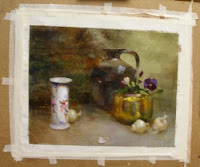
On May 16, Jack Keledjian demonstrated the style and methods that Emil Carlson used when painting his still lifes. Emil Carlson had a unique style. His compositions were simple, soft, and they drew you in. His subjects were simple earthenware jugs, shiny brass and copper pots, and simple Chinese blue and white vases with dark wood stands.
Jack mixes Neo Meglip by Gamblin into his paint to give the paint the glossy, smooth quality that Carlson is famous for. It is the consistency of Vaseline.
Before he starts, Jack tells us that we need to think very carefully about our subject and to imagine what we are going to paint, each aspect of it before we begin to paint. Do not center your main object, but pick a location on the canvas that is off center. This provides better interest. Harmony is very important, he says. Work each stroke in relation to the one next to it.
In speaking of temperature, it is important to note that a color is not warm or cold until there is something next to it to compare it t o.
o.
Jack starts with a pale yellowish green color in acrylic paint, covering the canvas. This is the under painting that will come through later. You can do this in oil as well, but it will take longer to dry.
Jack begins by drawing the objects with a light brown shade, using the drawing to place the objects on the canvas correctly. Jack puts in the background strokes with broad swishes of the brush in crisscross pattern, almost basket weave-like. He uses cobalt blue, ultramarine blue, and trans. oxide brown. It's not solidly applied, letting the background color come through. You can use a crumpled cloth to pull out some of the color afterwards.
Jack starts by filling in each object with large strokes, but leaves light areas undone. He limits the number of highlights. The large brown crock is done in a dark brown with soft edges to keep it from coming forward. For the brass pot, he uses browns and cad orange, always using some Neo Meglip. He works on getting the rounded shape, and will punch the color with two strong swipes. He says to make sure that the color temperatures work together. Always put warm near cool, otherwise the colors look dirty.
For the vase, he uses several long top-to-bottom strokes of pale bluish purple in varying degrees of color and then softens the edges to blend them. Then he warms the shadow with some yellow. He punches the light with a lighter white blue. He puts the flowers on with small cross strokes, and then the leaves.
For the pansies, he uses orange to cut the purple color intensity. He lays on paint with a large brush in fan like strokes, one next to the other. Instead of the yellow pansy, he puts in a off-white bud. The yellow is too intense.
The onions were softly rounded and quiet, but interesting. He used some warm red and yellow to push back the brightness of the white. He added a onion skin at the bottom of the canvas and some flower blossoms leading into the pots. Lastly, he cooled the bottom right foreground and warmed the bottom left foreground.
leading into the painting. He cooled the bottom right foreground and warmed the bottom left foreground.
1 week ago


No comments:
Post a Comment