Sunday, December 20, 2020

Pattern and its Unifying Effects

Pattern is an underlying structure that organizes surfaces or structures in a consistent, regular manner. Pattern can be described as a repeating unit of shape or form, but it can also be thought of as the “skeleton” that organizes the parts of a composition. It is one of the most effective ways to unify a painting.
A compositional technique that is not new, Pattern can be found in ancient Chinese, Egyptian and Greek art. It was used extensively as a mode of design by artists in the 17th century when the chiaroscuro technique became popular. Chiaroscuro is a method of painting using strong contrasts between light and dark. 


An excellent example of pattern is “Descent from the Cross,” by Peter Paul Reubens. In this painting, the eye is drawn first to the white drapery, and then to the figure of Christ. The eye flows downward from the upper right side toward the lower left and then the middle, with strong contrasting shapes, using light values and vibrant color.


Christ in the Storm on the Sea of Galilee
     by Rembrandt Harmenszoon van Rijn

Another example of pattern is Rembrandt’s "Christ in the Storm on the Sea of Galilee," where the lighter values emphasize the focus of the painting, while the darker values deemphasize everything else around it. The brightest shapes, the waves that are lashing the boat and the crew that is struggling to manage the sails are bathed in light, while the rest of the passengers, including the sleeping Christ are in shadow. 

 "Cumbrian Waterfall" by Richard Schmid

Nature sometimes provides excellent examples of pattern. In “Cumbrian Waterfall,” Richard Schmid used the natural formation of a waterfall and created a single connected shape of light value that winds its way downward between two shapes of contrasting dark values. Your eyes are immediately drawn to the flowing water and follow it downward.

Creating Pattern

Pattern can be a large shape (or a grouping of shapes) within a picture that forms an abstract design. You can create this shape by connecting dark or light shapes of a subject against a contrasting background. Sometimes nature provides a ready-made pattern. Other times, as in still life setups, you can manipulate your subject to achieve an interesting pattern.
Patterns in Nature

Peter S. Stevens, a Harvard biologist, in his book entitled “Patterns in Nature” claims that there are only a finite number of ways that patterns can be structured in nature.

He says that pattern can be classified in five different ways:
  • Flow
  • Branching
  • Spiral
  • Packing
  • Cracking
All things Flow, following paths of least resistance. Flow can be seen in water, stone, and the growth of trees and other plants. A meandering form of flow shows a movement and repetition of an undulating line.

Branching occurs in the plant world in trees and many plants, but it can also be seen in geological formations, including river deltas.

Galaxies form Spiral patterns, but you can also see evidence of spiral patterns in the opening “fiddlehead” buds of ferns and in nautilus shells.

Packing refers to the way in which compacted cells define each other’s shape. A densely packed cluster of mushrooms will grow together, deforming the circular form of each cap because of crowding.

Cracking Surfaces (like mud or old paint) that shrink as they dry may experience cracking, resulting in a similar cellular pattern.

Thursday, December 3, 2020

Subject and Focus

 Recently, I wrote about two methods of composition, specifically the Golden Mean and the Rule of Thirds. Both have been popular techniques for designing a composition for centuries and are still valid today. I’d like to take a step back and talk about the first stages of designing a picture. Before you can decide how to arrange a subject, you need to have an interesting subject, one that you are drawn to and one that attracts the viewer. Along with that decision, you should be thinking about the main focus of your composition. Without a focus, the viewer will become confused, and the design will seem as if it is missing something.

Choosing an Interesting Subject

The decision to paint something revolves around two things: 1. the object, person, or view and 2. your interpretation of that subject. Both are related. What you paint has to be interesting enough to make you want to paint it, beyond thoughts of how pretty it is or how different it is. You need to see your subject as you would interpret it. You should be emotionally drawn to it, with the thought running through your mind, “There’s something about this subject that stirs my imagination. I need to draw/paint it!” For example, I was interested in this old red farmhouse that was surrounded by lush old oak trees with a meandering dirt path leading up to it. But, when some guinea hens began to strut toward the house, I knew I had my subject. I deliberately brightened the area around the leading hens to draw the eye inward onto the hens and up toward the house. 

A good painting unites both the subject before you and your interpretation. When you decide on your picture, you should take into account the values, light, shapes, and negative spaces and arrange all to make a unified whole.


“The artist brain is the sensory brain: sight and sound, smell and taste, touch. These are the elements of magic, and magic is the elemental stuff of art.” Julia Cameron, The Artist’s Way

Your Composition Should Have a Focus

Whether it’s a drawing or a painting, your composition should include something that represents the central focus.

Wherever we look, our eyes naturally find something to focus on, and as we do, everything else becomes secondary. It’s impossible to focus on more than one thing at once. You will see things in your peripheral vision, but not as clearly as the subject your eyes are focused on. So, too, should your picture have something that draws the eye, with everything around it holding a subordinate position. Without a central focus, your picture is just a collection of artifacts. A focus is where the lines of direction and movement should lead the eye. That place should draw a person’s attention and keep it in the picture. Sometimes it’s obvious what the focal point is.

This picture, Duck Sitting on Falls, is a perfect example of a strong focal point. I remember that it was a pleasantly warm summer day so I decided to check out the park where a fresh water pond with a stone bridge stretched several blocks. There were ducks and geese enjoying the water on one end of the pond. At the other end, the sound of a slow waterfall called me like a peaceful lure. A few ducks were lazily swimming about, but I was taken by the nature of the scene on the falls in front of me. A duck is resting in the sun near the edge of the falls. He appears to be enjoying the cool, rhythmic flow of the water below. It inspired me emotionally and I knew right away that he would be my focal point.

The focal point is the most interesting part of the picture and it’s what draws the eye on first sight. But how does one figure out the focal point in a scene where there are a number of things vying for attention? This is where interpretation comes in. You are the artist, it’s up to you to figure out your focal point, emphasize it, and subdue or eliminate the other items. 

To create a single powerful center of interest, use the brightest colors, the sharpest edges, and the most contrasting values to make it stand out. The trees in the background of this picture have softer edges and receding values. The waterfall below the duck directs the eye vertically upward. The brightest area of the picture is the body of the duck, and it has the sharpest edges and strongest contrast.

The next time you decide to paint or draw something, keep in mind both the importance and emotional investment of the subject and how it can become the focal point of your picture. 

Wednesday, November 25, 2020

My Favorite Gardens

This week I'd like to share some of my paintings of the gardens that I have visited and enjoyed painting. I love to paint en plein air at all types of places, including urban landscapes, beaches, lakes, fields and farms, but I love painting beautiful gardens the best of all. When the daffodils come out and hail the beginning of spring, I get excited by the bright cheerful colors that pop up among the dull browns left from winter's cold embrace. As soon as the weather permits, I'm hunting for garden spots all over the state. Here are a few wonderful places that I've visited lately.

The Pardee Rose Garden

The Pardee Rose Garden in Hamden is a hidden gem. It's small, just about two acres, but the roses are not to be missed. It's quiet and somewhat hidden, but a wonderful secluded place to paint, draw, or just take a stroll. The garden is sectioned off with stretches of wild and hybrid roses and other flowering plants. The park established in 1922 was a gift from William S. Pardee. It is part of Edgerton park and is maintained by the city of New Haven.

Harkness Memorial State Park

I often go to paint at Harkness Memorial State Park in Waterford. There are several gardens to choose from and they all have their distinctive design. The scene here is the Duck Boy fountain in the West Garden. The gardens are maintained by the state with the help of many volunteers.

The mansion, ‘Eolia’ named for the island home of the Greek god of winds, was built in 1906 and purchased by Edward and Mary Harkness in 1907. The 200+ acres were a working farm and the Mansion was the Harkness’ summer home.

From 1918 to 1929, Beatrix Jones Farrand (landscape designer, one of the founders of the American Society of Landscape Architects) redesigned the west garden and created and installed the East Garden, the Boxwood Parterre and the Alpine Rock Garden.

Elizabeth Park Rose Garden

The Elizabeth Park Rose Garden, located in Hartford, is a great place to paint if you love roses. The arches are in full bloom in mid-June into early July, and are just spectacular.

The Helen S Kaman Rose Garden is the center of Elizabeth Park. It is the first municipal rose garden in the United States and the third largest rose garden in the country.

Elizabeth Park's Rose Garden became the first official test garden in 1912 for the American Rose Society founded in 1892, with the idea to test and to provide accurate information about roses for the public. This is when the half-circular section of the garden was added on the south side of the main square. In 1937, the American Rose Society asked the Park to add another semi-circle, which completes the garden of 2.5 acres as it stands today.

Florence Griswold Museum

With the twelve acres of scenic beauty, there's plenty of places to paint at the Florence Griswold Museum in Old Lyme. Miss Florence’s garden and orchard were the subject for so many paintings by the Lyme Art Colony artists in the early 1900s. Florence Griswold was a keen gardener. From seed catalogs and references to gardening books among her correspondence, she was constantly in search of new and unusual plants. She helped others, including several of the Lyme artists, to establish their own gardens with “good, old-fashioned flowers” and filled her own home with small, informally arranged bouquets of fresh flowers.


Hollister House Garden

I recently discovered a beautiful, magical place to paint, the Hollister House Garden in Washington.
Designed with American interpretation of classic English gardens, it is formal in its structure but informal and rather wild in its style of planting. Begun in 1979 by George Schoellkopf, the garden is sited on the southeastern side of a rambling but serenely dignified eighteenth century house on 25 acres of mostly wooded countryside.

The garden unfolds in successive layers of space and color with delightful informal vistas from one section to the next. Eight-to-ten-foot walls and hedges with dramatic changes in level define the progression of garden spaces – “rooms” as the English like to say – and create a firm architectural framework for the romantic abundance of the plantings. A winding brook and a large pond at the bottom of the lawn add to the variety of the garden scene. They welcome plein air painters every Wednesday morning from 8 am-12 pm. It’s free. Just sign up on their website.

Jeanne’s Garden

I happen to know a few people who are avid gardeners, and my friend Jeanne is one of them. Not a day goes by that she's not out working hard in her gardens. There’s one large sunny one with meandering crushed stone paths that flowers most of the spring, summer and fall. She also has a peaceful shade garden replete with a wooden swing for those lazy days spent with a good book. If she's not in her garden, she's in her shed re-potting plants, making markers for her plants, or starting seedlings.
It's easy to find something beautiful to paint there.

My Quince Bush

My quince bush was especially beautiful this year. The blossoms are mostly pink, but here and there some red petals appear, adding an interesting twist. I love to garden and this year was a good one for flowering plants. From the white and yellow daffodils to the pale pink and fuchsia peonies, the fiery bee balm, peach and ruby day lilies and tall orange centered pink cone flowers, it's fun to see what colors are going to appear next. And, it's fun to watch the hummingbirds, butterflies and bees hover around the blossoms as they gather their food. Sometimes, your backyard is as good a place to paint as any.

Famous Paintings of Gardens

From Sargent to Sorolla, Jonas Wood to Winston Churchill, Berkshire to Bali — here's a video and some reading on how artists have found solace and inspiration in gardens the world over.

Christies' Are these the most beautiful gardens in art?

Monday, November 16, 2020

The Golden Mean and the Rule of Thirds

The composition of a drawing or painting is crucial to its success. A strong and solid design draws the eye and stirs emotions. Though there are no hard and fast rules for composition, there are guides that are helpful when designing a layout. Two of the most popular guides that have been used throughout history are the Golden Mean and its relative, the Rule of Thirds.

The Golden Mean The Golden Mean or Golden Ratio has gone by many names through the ages: The Divine Proportion, The Golden Section, Medial Section and Golden Cut. Its visual representation shows up again and again in the world that surrounds us, from the architecture of The Great Pyramids to the paintings of Leonardo da Vinci to the Fibonacci Sequence that we see in nature and the galaxies.

Golden Mean’s Origins

The Golden Mean’s origins are rooted in mathematics. The unique number known as “Phi” — 1.618 — represents a “Golden Ratio” that can be found in art, theology, cosmology, nature, architecture — even financial markets.

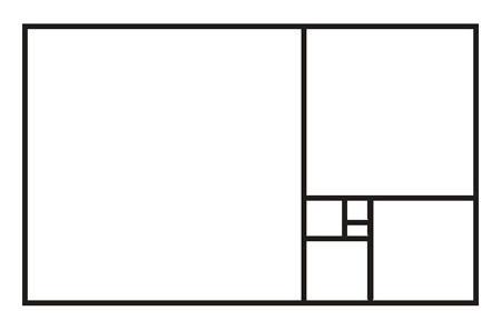
Phi is derived by dividing a line so that the longer section divided by the shorter is equal to the full length of the line divided by the longer. You’re probably scratching your head if you are anyone like me. I’m not a mathematician and the very thought of math gives me agida, so I need a visual example. Here’s what Phi looks like when it’s geometrically reduced down several times into what are known as Golden Rectangles.

Philosophical Interpretation

Thousands of years ago, ancient Greek philosophers, notably Aristotle, started converting the mathematical Golden Mean into a philosophical interpretation. The Greeks felt it was an attribute of beauty and believed that there is a close association in mathematics between beauty and truth. They believed there were three "ingredients" to beauty: symmetry, proportion and harmony.

Similar interpretations can be found in ancient Buddhist, Christian, Islamic, Hindu, and Judaism teachings. Its definition varied a bit from discipline to discipline, but the essence was always the same: Stay away from the extremes. Find the middle track. Out of moderation, comes virtues. Truth. Beauty. Balance. If you can travel the middle path of moderation and temperance, goodness and beauty will accompany you. The Mean was so essential to Greek philosophy that they inscribed it on the Temple of the Apollo at Delphi: μηδὲν ἄγαν μηδὲν ἄγαν — “nothing in excess.”

The Golden Spiral

Using Golden Rectangles as a guide, you can create a design guide known as the Golden Spiral. Connect the nesting points of the Golden Rectangles with the arcs of 1/4 of a circle, sizing each to fit. The Golden Spiral design integrates movement, direction, and asymmetry in a pleasing arrangement. You will find several examples of the Golden Spiral in Renaissance art, including Botticelli’s The Birth of Venus and Michelangelo’s The Creation of Adam.

When designing a picture, whether a painting or drawing, keep in mind how you want to direct the eye. Using the Golden Spiral, you can draw in the eye with shapes, lines and colors and gradually lead the eye to your center of focus. You can turn the spiral around and flip it in any direction and use it as a guide to place your center of focus.
In this painting, the brightest area (the yellow building), is the middle of the spiral, and the eye is drawn along the shoreline and upward and around to it.


A variation of the spiral can be found throughout nature, including flowers and plants, weather patterns, outer space, and sea shells.


The Rule of Thirds

A relative to the Golden Mean is the Rule of Thirds. The Rule of Thirds states that an image is most pleasing when its subjects or regions are composed along imaginary lines which divide the image into thirds — both vertically and horizontally. Here’s an example of the division of a rectangle using the Rule of Thirds:

You don’t need to perfectly align everything with the thirds of an image. The important thing is to place your main focus approximately where the lines cross. In most cases, try to avoid putting the focus in the middle of the picture.


For landscapes, this usually means having the horizon align with the upper or lower third of the image. This can make landscape compositions much more dynamic. Also, placing your subject off center can provide a sense of direction for the eye. I find that I often use this method to place the focus of my paintings.

Next

I hope you enjoyed this lesson on the Golden Mean and the Rule of Thirds. Hopefully, you will think about these methods when you draw or paint a picture. Next time, I will take a break from my online instruction and show you some of my latest artwork. I’ll include my recommendations for beautiful places to paint and draw.

Monday, November 2, 2020

Alkyd Mediums

You can use oil paint straight from the tube or dilute it with thinners. However, you can also experiment with drying oils, resins, waxes, and diluents to alter the characteristics of your tube color. Most manufacturers offer several types of medium that can improve the flow of paint, provide a satin or gloss finish and speed up or retard the drying time of oil paint. Last week, I explained how drying oils work as binders and as mediums. This week, we’ll take a look at Alkyd mediums.


Composition of Alkyd Mediums

Alkyd mediums are made up of resins produced by a reaction of natural oil with a poly-functional alcohol and poly-basic acid.

There are two ways of introducing an alkyd into your painting. The first and most common is the use of an alkyd medium. Alkyd painting mediums are popular because they are made with milder solvents and speed the drying time of oil colors. Liquin and Galkyd are the best-known alkyd mediums. M. Graham also makes a walnut oil-based alkyd, which is the glossiest followed by the Galkyd, with the Liquin having a more satin finish. Liquin and Galkyd contain lead, which speeds up the drying time, but can be toxic in a closed setting. For this reason, you should only use alkyd resins in an open area with good ventilation.


Benefits of Using Alkyd Mediums

Thin layers of oil colors mixed with alkyd resin painting medium will dry in twenty-four hours and make very tough, yet flexible paint films. Alkyd-based painting mediums can also add gloss and transparency to paint layers and help prevent drying in, which is when the darks in a painting lose their gloss and look matte compared to other parts of the picture. Good for layering, alkyd mediums can be used for very complex glazing applications. Drying time can be extended by adding a few drops of linseed oil. Mineral spirits can be used for thinning. 

Thick Vs. Thin Alkyds

Alkyds are available in a variety of properties, including thinning, thickening, glossy finish, matte finish, fast drying time, slow drying time and come in fluids or gels. Fluids can be obtained in both fast or slow-drying, high viscosity (thicker, can show brush marks), or low viscosity (great for washes). Gels are thicker than the high viscosity fluids, and can be used to show pronounced brush marks in the paint film and will not turn into a fluid as they are worked. Gels also come in various viscosities aimed principally at the painters who want to develop more impasto in their work.

Alkyd Paint

The second means of introducing alkyd into a painting is the use alkyd paints. There are several available, including Da Vinci, C.A.S., Gamblin, Grumbacher, and Windsor & Newton. Note: As a binder, alkyd resin cannot hold as high a pigment load as linseed oil. Alkyds can be mixed with regular oils and are reduced with the same solvents. To speed up the drying time of regular oils, you can substitute a few of your most frequently used oil colors for alkyd colors, such as white and ultramarine blue. Because these colors are used in so many mixtures, it speeds up the overall drying time of all colors.


Some Cautions

For optimal adhesion, alkyd mediums should not be used over the top of traditional oil painting mediums or unmodified, slow-drying paint. Regular oil paint can be layered over alkyds, but it is not recommended that alkyds be layered over oil, as the less flexible alkyd film may crack. Adding an alkyd resin will make a color layer fatter, while adding solvent will make a color layer leaner. Therefore, only the lower layers should contain solvent and the upper layers should contain increasing amounts of alkyd medium.

Conclusion

Alkyd resins can change the look and feel of your paint. Some artists don’t use any alkyd resins, claiming that they dilute the color intensity and lack the "jewel like" look of oil paint. While alkyds are a very durable material, they can become brittle with age and must be used judiciously by the artist. It’s worth experimenting with alkyd resins, especially when it’s important to speed up drying time. Just be careful to use them safely, correctly and sparingly.

Note on Comparing Food Grade to Artist Grade Oil

Last week, I forgot to mention that it’s best to use products that are made and sold for art production. An artist friend pointed this out to me and I thought I would pass this on. You should always use artist grade dryer oils when painting, since they have a longer shelf life than food grade oil, are of superior quality and there’s less of a chance of them going rancid. Artist’s linseed oil’s long shelf life is due to Alkali refinement (a ‘washing’ process) that removes most of the free fatty acids, mucilage and other impurities that can lead to rapid spoilage. How prone a particular oil is to going rancid is due to fatty acid composition. Flax oil has a shorter shelf life than safflower oil, due to higher percentage of fatty acids. Drying oils are mostly made up of unsaturated fatty acids (e.g. linolenic and linoleic acids). These fatty acids are the components that produce an “off” smell through oxidation, and also what makes oil paint dry.


Sunday, October 18, 2020

Organic Binders

Pigments are ground and mixed with a drying oil, commonly known as a vehicle or binder. They are called binders because they suspend the pigment in the oil, making it easy to apply the paint on the painting surface. Eventually, the oil dries as it absorbs oxygen, sealing the pigment to the surface. There are several types of organic binders used in painting, but I will review the most common of them. These include linseed, stand, sun-refined or sun-bleached, poppy seed, walnut and safflower oils.

Linseed Oil

The most commonly used binder and oil medium is linseed oil. Linseed oil is made by pressing the ripe seeds of the flax plant. There are two types of linseed oil, hot pressed and cold pressed. Inexpensive linseed oil is made by applying extreme pressure and heat. After hot pressing, any oil left in the seeds is extracted using solvents. The solvent is evaporated, the remaining oil is then added to the hot-pressed oil which undergoes a refining process. Cold-pressed linseed oil is made with some pressure, but no heat. It is the purest form of linseed oil because it has superior binding ability and is less likely to become brittle with age compared to hot-pressed oil. Refined linseed oil is oil refined with sulfuric acid and water, removing more of the impurities. It does not bind as well as cold pressed.

Linseed oil is used as both a binder and as a painting medium. It is usually the preferred choice for clear painting oils because of its durability. Manufacturers usually base their binder on linseed oil and may mix in or substitute poppyseed oil according to their preference. Though linseed oil dries quickly at first, the complete drying process takes several years. As it ages, linseed oil dries into a tough, leather-like film that hardens and becomes more transparent with age.

Stand Oil

Stand oil is made by heating linseed oil to 525-575° F and holding that temperature for a number of hours. A molecular change occurs, though it doesn’t change the physical properties of the oil. Stand oil is a heavy oil, similar in consistency of honey. It is usually mixed with several parts of turpentine, resulting in a paler color than other linseed oils. Artists prefer stand oil mixed with thinners as a glazing medium, a paint mixing medium, and with varnishes. Because of its unique ability to dry to a smooth, enamel-like film free of brush strokes, it is a superior binder for glazing. And, mixed with other ingredients, the resulting medium ages well and is nearly non-yellowing.

Sun-Refined or Sun-Bleached Oil

Sun-refined or sun-bleached oil is made by combining oil with an equal amount of water and then exposing it to sunlight and limited air exposure for several weeks. At the end of this period, the impurities will settle to the bottom and the oil is filtered and separated from the water. The result is a thicker, more viscous oil, which hampers its binding abilities, but speeds up drying time. This type of oil is more suitable for a clear varnish, glaze, and painting medium. However, it is more prone to yellowing than cold-pressed and refined oils. 

Poppyseed Oil

Poppyseed oil is a colorless to straw-colored oil pressed from the poppy seed. It is most often used as a binder mixed with whites and pale colors as it is less prone to yellowing than linseed oil. However, compared with linseed oil, it dries much slower. The film is spongy and has a tendency to crack, especially when the pigment is layered. Poppyseed oil is most often used by artists in direct or alla prima single layer painting.

Walnut Oil

Walnut oil is derived from the stale kernels of the common or English walnut. The film of walnut oil when dry is stronger than Poppy oil (though still not as strong as linseed) which makes it a better oil to use in the initial layers of paint. It is a great oil to use when painting detail and it has a similar drying time to linseed oil. Though it dries as quickly as linseed oil, it has a tendency to grow rancid with storage and is not recommended as a paint medium.

Safflower Oil

Safflower Oil is also used to make whites in some brands because it is bright and clean with less tendency to yellow than linseed oil. It takes 2-3 days longer to dry than linseed so is recommended only for use in the final layers of a painting.

More on Binders

Linseed, poppyseed, walnut and safflower oils may be mixed with one another. You can find binders mentioned here at most art supply stores. You should experiment with them, but keep in mind the properties of each and their shortcomings.

For more information about binders, check out The Artist’s Handbook of Materials and Techniques by Ralph Mayer.

Next:

I will talk about the different mediums available for painters.

Sunday, August 23, 2020

What is Oil Paint?


We buy a tube of oil paint, untwist the cap and put a small pile of it on our palettes without a second thought as to what goes into it. But it wasn't always this easy.

In Southern Europe, early man mixed animal fats with earth and stain to form the very first oil paints and applied them to grotto walls. During the 15th century, Belgian painter Jan van Eyck, mixed linseed oil and oil from nuts with diverse colors.

Later, artists would purchase the dry lumps of color, much of it in rock form, and grind it into powder before adding oil. Soon after, vendors sold the powdered pigments and oils so the artist was able to mix their own. In the late 1800s, paint became available in tubes, a convenience for artists who painted en plein air.

Today, oil paint is composed of dry oil pigments ground in a natural drying oil such as linseed. They usually include additives such as plasticizers, driers and wax to improve flexibility and make them consistent in texture and drying speed. Some brands of paint are allowed to age and then additional pigments are added to achieve consistency.


Grades of Paint

There are two grades of paint:
  • Professional Artist Quality
  • Student Grade
Professional or Artist Grade offers larger range of colors and have the best color strength: Have high concentration of pigment that is finely ground with the best quality oils. As a result, the colors are brighter and have more covering strength on the canvas. They are also the most expensive of the oil paint choices.

They are commonly cataloged into six series by rarity and value, Series 1 (or A) being the most plentiful and least expensive, and Series 6 (or F) being the rarest and most expensive. Professional grade paint brands include:
  • Rembrandt
  • Schmincke Mussini Oils
  • Holbein
  • Blockx
  • Old Holland
  • Sennelier
  • Williamsburg
  • Daniel Smith
  • Grumbacher Pre-tested
  • Michael Harding
  • Utrecht
  • M. Graham
Student Grade oil paint has limited colors and is made in large batches.

Student Grade oil paint tends to use more inert fillers such as chalk and less pure pigment. The result is less vivid colors, less tinting strength and less colorful effect overall. Student grade cadmium colors are sometimes called “hues.” Student grade paint brands include:
  • Winton
  • Grumbacher Academy
  • Bob Ross
  • Daler Rowney Georgian
  • Windsor Newton Artist’s Oil Color (Pro/Student)
  • Gamblin 1980
  • Van Gogh
  • Blick Studio

Drying time

The time it takes for a color to dry depends on the amount and type of oil added to the pigment and the color. Generally, earth colors dry the fastest. Cadmium colors, alizarin crimson, blacks and white dry the slowest.

Brands

Colors of the same name from different manufacturers will vary in color, cost, consistency, permanence, and drying rates.