Wednesday, December 8, 2021

The Paintbox: Ultramarine Blue

In London’s National Gallery is an unfinished oil on wood panel, The Entombment, by Michelangelo. Many of the unfinished parts of the painting, such as the cloak of the missing Virgin, would have required quantities of the expensive blue pigment ultramarine made from powdered lapis lazuli, the only blue worthy of the Virgin Mary’s robe.

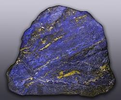
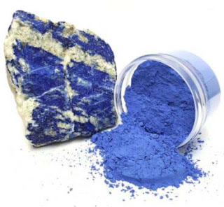
It’s possible that lapis lazuli was in short supply and had not arrived from his patron, which could explain why the painting was not completed before Michelangelo’s departure from Rome to Florence in 1501.

Definition and Composition

Cennino Cennini said of ultramarine in his Book of Arts in 1400, “A noble color, beautiful, the most perfect of all colors.”

Ultramarine is a deep blue pigment, originally made by grinding lapis lazuli into a powder. The name is Latin for ultramrinus, meaning “beyond the sea.”

Lapis lazuli is a mixture of the minerals calcite, sodalite, pyrite, and lazurite. Finer grades contain more sulphur, which produces a violet color, while inferior grades contain more calcium carbonate, giving it a grayish tone. The impurities are removed in the processing to produce the pigment. 

History 

 Between the eleventh and eighteenth centuries, the main west-east axis, the Silk Road, brought Asian materials, including silk, inventions and art to Europe. The Silk Road consisted of land routes connecting East Asia and Southeast Asia with South Asia, Persia, the Arabian Peninsula, East Africa and Southern Europe. Mediterranean trade between the Middle East and North Africa and Europe in the twelfth through fourteenth centuries was conducted largely by Italian and Greek maritime republics.


During this period, Italian traders introduced lapis lazuli to Europe from Afghanistan, most notably, from ancient mines in Sar-e-sang, the “Place of the Stone,” a settlement in the Kuran Wa Munjan District of Badakhshan Province. Today, it can be found in other locations including Asia, America, Chile, Zambia, and Siberia but only a couple of Afghan mines produce the highest grade (a very deep purplish blue) of this unique stone. In 1826, French chemist Jean-Baptiste Guimet created a synthetic version of ultramarine by heating kaolinite, sodium carbonate and sulfur. The result was a more vivid color and less expensive to produce than traditional ultramarine. The new color was named French Ultramarine.


Tuesday, November 2, 2021

Ochre, the First Color

The word “ochre” comes from the Greek language, originally meaning “pale yellow.” Ochre is a natural clay earth pigment made of a mixture of ferric oxide and varying amounts of clay and sand. It ranges in color from yellow to deep orange or brown. It is also the name of the colors produced by this pigment, especially a light brownish-yellow.


A variant of ochre containing a large amount of hematite, or dehydrated iron oxide, has a reddish tint known as “red ochre.” The range of earth pigments include yellow ochre, red ochre, purple ochre, sienna, and umber. The major ingredient of all the ochres, iron oxide-hydroxide, known as limonite, renders a yellow color.

Ochre occurs naturally in rocks and soil in any environment where iron minerals have pooled and formed, including valley edges, cliffs or in caves eroding out of the bedrock. Other than serving as paint, ochre was used to tan hides, as mosquito repellent, for protection against the sun or cold, for medicinal purposes, for use in the extraction or processing of plants, and as an adhesive, such as attaching handles to stone tools. Because ochre is a mineral, it doesn't wash away or decay, hence the existence of ancient examples of art and traditions using ochre.

  • The practice of ochre painting has been prevalent among Indigenous Australian people for over 40,000 years. Really good ochre was a prized trade item right up until the 1980s.
  • In Africa, archeologists discovered ochre mines dating back 40,000 years.
  • A highly prized form of ochre came from the Black Sea city of Sinope, in the area now known as Turkey. It was deemed so valuable that the paint was stamped with a special seal, known as sealed Sinope. Sinopia soon became synonymous for red ochre. 

History

Ochre was the first paint color. Traces of it can be found on every continent since painting began. Iron oxide is one of the most common minerals found on earth, and there is ample evidence that yellow and red ochre pigment was used in prehistoric and ancient times by many different civilizations on different continents.

  • The first American settlers named the indigenous people Red Indians because of the red ochre that they used as body paint.
  • Red ochre paint was used in ancient China, evident from early examples of black and red pottery dating between 5000 and 3000 BC.
  • Ochre is often found in ancient burials. It’s thought that the clothing was dyed with ochre, but as the clothing decayed, the ochre stained the grave and bones red. Originally thought to be the bones of an indecent woman, the stained red bones of the famous Red Lady of Paviland in South Wales, UK, was actually the remains of a young man who lived 33,000 years ago during the Paleolithic age.
  • Researchers diving into dark submerged caves on Mexico’s Yucatan Peninsula have found evidence of an ambitious mining operation for red ochre from 12,000 years ago.

  • Frequent references in Irish myth to “red men” suggest that the practice of body painting with red ochre was common to the ancient Celts.

Magnetic Qualities

Italian Scientists examining red paint are able to date frescos by studying the direction of the iron molecules in the paint. The molecules act like compass needles, aligning themselves with magnetic north during the time it takes to dry on the wet clay. Because Magnetic north changes every year and fluctuates over a range of 18 degrees, scientists are able to determine what year a fresco was painted.


Fresco, “The Flight into Egypt” by Italian artist Giotto di Bondone.

“The chameleon changes color to match the earth, the earth doesn’t change color to match the chameleon.” ~ Senegalese Proverbs

Monday, October 4, 2021

Green, Symbol of Hope or the Harbinger of Death

The word green is closely related to the Old English verb growan, “to grow.” In some cultures, green symbolizes hope, fertility and growth, while in others, it is associated with death, sickness, or the devil. It can also describe someone who is inexperienced, jealous, or sick. More recently, green symbolizes ecology and the environment.

Green is considered a secondary color created by mixing yellow and blue. Green pigments have been used since Antiquity. The Egyptians made green from natural earth and malachite.

Greeks introduced verdigris, one of the first artificial pigments. Copper resonate was introduced in European 15th century easel panting, but was soon discarded.

Green was once considered a secret color by the Chinese and more prized than gold, with only a select few able to obtain the dyes for it. In central Asia, celadon was for centuries thought to have secret magical powers. Celadon is a term for pottery denoting both wares glazed in the jade green celadon color, also known as greenware, and a type of transparent glaze, often with small cracks, that was first used on greenware, but later used on other porcelains.


Longquan celadons produced in Longquan, Zhejiang, China in the 13th century.

Muslims believed the color green to have alexipharmic (antidote for poison) powers. If celadon tableware was used to prepare and serve food, the family was thought to be protected from poison. William Warham, the Archbishop of Canterbury, owned a sea green cup that may have been given to him to protect him from poisonous food, since he was a taster for official dinners.

Green was associated with Indian mysticism, and was found in Asian poems and Buddhist artwork. During the Romantic period, green was considered akin to the beauty of nature. Chinese Wallpapers popular among the nobility from the time of Mary Queen of Scotts show green vines creeping up walls with all manner of exotic green plants and birds.

But there was a sinister side to the green paint used by artists during this time. A chemist, Carl Wilhelm Scheele patented a new brilliant green paint he named Scheele’s Green. He came upon it accidentally while experimenting with arsenic in 1775. Though he privately noted that the new color might be toxic, it didn’t deter him from obtaining a patent. Soon manufacturers were using the new pigment for paints, wallpapers and all types of household items.

Green wallpaper was thought to contribute to the demise of Napoleon Bonaparte. The Longmont estate where he was being held in exile on the island of St. Helena was subject to dampness. It is believed that the mold that formed on the walls reacted with the arsenic in the green patterned wallpaper, causing the air in the house to become infused with the poison. A strip of wallpaper was torn off of a wall and recently scientifically tested. Traces of Scheele’s arsenite was found in the patterns of green and gold fleurs-de-lis.


Around the same time, a sample of his hair was tested and shown to contain a level of arsenic twenty times the safest amount. Though at the time of his death he was diagnosed with stomach cancer, it’s possible that what led to this diagnosis was Napoleon’s exposure to arsenic, which is believed to be one cause of gastric carcinoma. Six years after his arrival at St. Helena, Napoleon died.

As it turned out, not only green, but yellow, blue and magenta held traces of arsenic. In 1888, Henry Carr reported that arsenic found in artificial flowers, carpets, toys, and fabrics as well as in paint and wallpaper was responsible for the deaths of children and adults. Still, the allure of bright greens over the dull grays and browns of that time was too strong and its use continued well into the 19th century before it was replaced with the safer cobalt green.

“It’s not easy being green.”

-Kermit: Sesame Street frog puppet, singing about identity 

Tuesday, August 31, 2021

Watery Reflections

Reflections give dimension to a picture, add color and depth, and suggest a mood. A reflection is not a mirror image of the object, though it may seem that way. When you paint a reflection, you are painting a distorted version of the reflector and its environment.

There are a few things to keep in mind when painting reflections. It’s important to determine the perspective of the reflectors, and your distance from them will determine the size and shape of the reflections. The type of surface of the reflector is also important. Is the reflected surface rough or smooth? A rougher surface gives a rougher, more distorted reflection, while a smooth surface’s reflection can be very clear.


Reflections are commonly found in water ways of all types because of the very nature of water. They also originate in inert objects like mirrors and shiny objects, like metals, and transparent objects like glass. The following are some considerations when painting subjects in water, such as buildings, the sun and the surrounding scenery and sky.

Reflections and Color

  • Dark colors in dry land become lighter when reflected in the water
  • Light colors on dry land become darker when reflected in the water.
  • The colors of the sky appear slightly darker on the surface of the water

Distance

The distance of the viewer to the water affects how clearly the image of the earth and sky are reflected.

  • When painting objects next to the water, the shadow cast by these objects usually makes it easier to view down below the surface, as the object blocks the reflection of the sky.
  • When standing close to calm water, the viewer will see only a weak reflection. Farther away, water will reflect details, acting nearly like a mirror.
  • When observing dirty water from a close distance you will be able to see the overall color of the water itself.

Shapes & Angles Reflected in the Water

Reflected images should not be rendered exactly as a mirrored object. Here are a few things to keep in mind:

  • The reflected scene in the water is the actual object reflected from two different angles.
  • The reflected image in the water bounces off the surface of the water.
  • What you actually see is the reflected scene below the surface from an angle for as far as your eyes can see.
  • You are actually seeing more below the reflected objects and even reflection of objects that you cannot see at all when you look directly at them.


Painting Ripples

Ripples combine the reflected colors from light and dark areas.

  • Use quick, energetic brushwork with side to side strokes of a thin brush.
  • Drag paint from dark reflected objects quickly into the light areas, clean the brush, then drag the paint from the light areas back into the dark.

“Reflect upon your present blessings, of which every man has many; not on your past misfortunes, of which all men have some. “   

-         Charles Dickens


Tuesday, July 13, 2021

Three-Point Perspective

Most of the time, one- or two-point perspective is what you will use when drawing. It’s often the view that you will see when you are observing something from a normal eyesight level. However, when you are viewing a scene from a more extreme position, you’ll want to use three-point perspective.
For example, you will use three-point perspective when you want to give the impression of looking up at a subject from a low position or down at it from a higher position.

A word of caution: your eyes can play tricks on you when you are trying to determine the perspective of an object. Remember to always use some form of measurement when deciding where to place your vanishing points and to determine the size of your subjects. It’s helpful to use a straight edge ruler when working with perspective and to practice drawing it on paper before you commit to other media.

Drawing a Three-Point Perspective

The following is an example of how to draw a three-point perspective.

First, start with a two-point perspective: Mark two vanishing points on a horizon line. Then, draw a line from each vanishing point to a point that will mark the bottom corner of a set of blocks, forming a “V”. Draw two more lines from the vanishing point to the first lines.

Directly below the front corner of the nearest rectangle, put a mark. This will be your third point.


Now, draw a line to the bottom corner of rectangle block, ending it a bit above the third point.

Connect the lines from the top edges of the rectangles to the third point.


Draw a line that begins at both vanishing points and ends at the bottom of the line of the nearest block.

The green line shows the group of blocks with the three-point perspective.


Wednesday, May 26, 2021

The Passing of a Legend

On April 18, 2021, the art world lost a modern legend, Richard Schmid. Richard Schmid was and will always be an artist that I look up to and one that I have learned a great deal about art and how to paint. I have almost all of his books and DVDs, and I refer to them often, their pages well-worn and many sections streaked with yellow highlights. Now as an art instructor, I often turn to them for inspiration for art instruction. Some of you may have seen some of his work, heard me talk about him or read about him in my past art emails.


My admiration for Richard Schmid goes back several years when I was just beginning to look for alternative art education. In 2007, I was searching the Internet for artists who were hosting workshops in the New England area and came across an artist named Albert Handel. I loved his style, which was modern impressionistic, and I wanted to learn his methods. He worked both with oils and pastels, and his paintings would sing with color in a relaxed manner that belied years of practice. 

I saw that he and Anita West were going to do a five-day workshop in Putney, Vermont at the Village Arts of Putney, a reclaimed New England barn turned art studio, so I decided to sign up for it. The first four days were spent at the barn and on location with Handel and West with demonstrations and plein air painting. I was in heaven! On the last day, we were all treated to an indoor still life demonstration by both Handel and the secret bonus artist: Richard Schmid. I had heard of Richard Schmid, read a lot about him and loved his work, but my painting studies came a little late and I missed being able to take instruction from him.

 Nancy, Anita, and Albert.

I couldn’t believe my luck when they told us that he and his wife Nancy, who is also a fabulous artist, would be there that day. He and Albert painted, each from their own angle, and the class took up positions behind them and watched in awe as both of them turned out terrific paintings, each in their own style, in less than four hours. Richard spoke about his love of his craft, intertwining serious thoughts about art with delightful jokes as he worked, but Albert was mostly quiet and took Richard’s occasional ribbing with graceful ease. They were lifelong friends, so as he worked, Richard regaled us with wonderful stories of their adventures painting together.

 Richard painting a floral still life.

Albert's pastel rendering.

I consider myself very lucky to have met Richard and be in his presence as he constructed another masterpiece in front of a enthralled group of students. From my notes of that day: “But the best part was meeting Richard Schmid and Nancy Guzik, and getting to watch Richard paint-what a treat!” and, “When Richard painted, all of his strokes were deliberate. He never repainted over an area, and he thought out every stroke.” As you can tell, I was captivated by his methods. I was also entranced by Albert’s pastel rendering, which was so deceptively casual and bursting with color.

Village Arts of Putney


At the end of the session, Richard, Nancy and Albert answered questions and signed books and prints. I bought two beautiful prints, one of Nancy’s and one of Richard’s, and a signed copy of Richard’s first book, Alla Prima, Everything I Know About Painting.

In 2008, I drove up to Putney, Vermont on Saturdays to take classes at the Village Arts of Putney with one of Richard’s students, Jack Keledjian. It was a fun place to gather with like-minded artists and to share our thoughts on art and painting, and it’s a memory that I will always treasure.

Additional reading: Richard Schmid

“Each one of us is here to make this world a better place through our art. What you create is important and who you are is to be treasured, and that together we can fill this world with beauty and make it a better place for all.”                                                                                        -           Nancy Guzik

“The most enjoyable experience for me is still plein air painting … and its natural companion, alla prima (painting from life),” writes Schmid. “What could be more exhilarating than getting out under a great sky and feeling a fresh breeze while I paint the delights of nature? Painting on the spot from life is the method I learned from the start of my training, and the one I regard as the most challenging and therefore most rewarding.”                                                                              - Richard Schmid


Monday, May 10, 2021

Two-Point Perspective

Recently, I presented an example of one-point perspective that uses one vanishing point. This week, I’d like to talk about another type of perspective in the Linear Perspective group, the two-point perspective. Two-point perspective is mostly evident in street and building scenes, as well as interiors. However, whenever there is a need to project depth and dimension, you will find that understanding two-point perspective will help in sizing and drawing all of your subjects.

The “two point” in a two-point perspective grid is referring to two different vanishing “points,” where each becomes an anchor that we use create a 3D object on a 2D plane (your canvas or paper).

Typically, these two points are at the opposite sides of the composition, with one on the far left and another on the far right.

Create a Two-Point Perspective Box or Building

To create a two-point perspective box or building, draw a straight line on a sheet of paper. This will be your horizon line or sight line. Place two points at opposite sides on the line.
Now, draw a line where the corner of your box or building will be in relation to the horizon line.


Connect the top and bottom of the corner line to both vanishing points.


Draw more lines that begin at the vanishing points and end at the lines that connect the corner line.


Draw perpendicular lines to finish the outlines of your box or building.

You can use this method to draw street scenes, such as this one. In this case, the vanishing points are off to the right and left of the scene, the horizon line cutting through the building horizontally.


“Perspective is to painting what the bridle is to the horse, the rudder to a ship.”

-Leonardo da Vinci

Tuesday, March 30, 2021

More on Perspective

Last week I wrote about how, with linear perspective, an object appears to diminish in size as the distance from the viewer increases. Linear perspective is a way to create an illusion of spatial depth in your artwork. It enables you to replicate a 3-D object on a 2-D canvas or drawing surface.

There are three types of linear perspective drawing: one-point perspective, two-point perspective, and three-point perspective.

One-Point Perspective

One-point perspective is a type of drawing created on a 2D plane that uses one point in the distance (the vanishing point) from which everything in the drawing is set out.

One of the best illustrations of single-point perspective is to imagine that you’re looking at a straight road. All of the elements of the composition—particularly the road itself—will converge at a single point on the horizon line.

Single-point perspective can be at any point along the horizon line; the only stipulation is that all lines lead to the solitary point.

 “Art happens-no hovel is safe from it, no prince can depend on it, the vastest intelligence cannot bring it about.”

-James Abbott McNeil Whistler


Sunday, March 7, 2021

The Horizon Line and Linear Perspective

 Linear perspective is a method of representing space in which the scale of an object diminishes as the distance from the viewer increases. Essentially, objects that are farther away from us appear smaller than those that are near. 

A horizon line is the intersection of where the ground or body of water meets the sky. The point at which diminishing directional lines meet on a horizon line is called the vanishing point. A city street is a great example of linear perspective. 

On this photo, you can take a ruler and run a line along both sides of the sidewalk into the distance to where they converge. The red dot in the second picture represents the sidewalk vanishing point on the horizon.


Skyline Vs. Horizon Line

Be careful not to confuse the skyline with the horizon line.

The skyline is also where the sky and land meet, but is generally in reference to mountains, which are almost always above the actual horizon line/eye level. The red line in the second photo shows the horizon line.


Tuesday, February 16, 2021

Scumbling

What I find so compelling about painting with oils is that there are so many ways to apply it. To make a strong statement, you can lay it on thickly like impasto. Thick paint goes hand in hand with coarse brushwork, often using bristle brushes to create a raised effect. The result immediately draws the viewer’s attention, and the three-dimensional strokes can evoke strong emotion. Oil paint applied thinly is equally great for portraits and realistic styles because you can softly blend areas while the paint is still wet, thus creating a subtle transition from one color to another. Another method of paint application that involves a “blend” of two colors is scumbling.

Scumbling is a painting technique that can be used to modify the color on a canvas, using a thin layer of paint. The under layer must first be dry. Using a dry bristle or synthetic brush or a clean lint-free rag, dip the brush or rag into a slightly thinned, semi-opaque color and loosely brush or scrub it on over the under layer with a circular or back and forth motion, only partly covering it. The scumble color should be lighter than the under layer to be most effective.

 A unique look can be achieved by using a complementary color as the scumble color, for example, a cadmium red over a viridian green. When it dries, you will notice that the green will resonate through the red layer. Similarly, you can cool down a hot color by scumbling over it with blue or green mixed with a little titanium white.

Here's the final result of my Composition painting with a scumbled background.


It’s a great technique that is worth investigating. I’ve applied a scumble layer to dark backgrounds with great results. Give it a try!


Tuesday, January 26, 2021

A Word About Varnish

Varnish is a clear, colorless solution containing a solvent and either a natural or synthetic resin that has been used for centuries on oil paintings and more recently on acrylic paintings.

Varnishing your paintings adds a layer of protection and can measurably affect its appearance.

Air contains a variety of pollutants that in time will cling to the surface of a painting and will alter the colors. Besides the air, your painting will be susceptible to moisture, including humidity, liquids, dust, and other contaminants. Most conservators recommend varnishing paintings because environmental pollutants are more easily removed from the varnish layer than from paint layers. Some prefer varnishes containing synthetic resins, which allow for the most reversible, least invasive conservation treatments. Some artists prefer more traditional varnishes containing natural resins such as damar and mastic, which are slower to dry than synthetic resin varnishes and, therefore, are more easily applied with a brush. But there are drawbacks to using traditional varnishes.

Color and Surface Unification 

 When you apply varnish, you will notice the color intensifies. A gloss varnish will deepen the color, while a satin finish will slightly strengthen the appearance.

Applying varnish also helps to create a unified surface. Sometimes a finished painting will have both shiny and dull areas. This variation can happen for several reasons.

Mixing paint brands-Different brands of paint use different ratios of ingredients (binder/pigment) and the types of fillers may differ. This inconsistency results in different levels of sheen.

Using Medium-Some oil painters use medium to control the viscosity of their paint. Some mediums, like Liquin, are glossy. If you have a different amount of medium in each stroke, you are likely to end up with an uneven surface.

Glazing - A glazed layer of paint will dry glossy. If you glaze only parts of your painting you should varnish it to even out the surface sheen.

When to Varnish

How to decide when it is safe to varnish is tricky. Drying rates vary greatly based on the thickness of the paint and on the temperature and humidity levels they are exposed to.

There’s no hard and fast rule. Thicker paint will dry slower while thin layers of paint will dry faster. The fingernail test is one way to determine if your painting is dry enough to varnish. Press a fingernail on the paint. If it can leave a mark, the paint is not dry enough to varnish. If it doesn’t leave a mark, like a dent, then you can varnish it. If your style of painting is impasto, you may have to wait a year to varnish.

Types of Varnish

There are several types of varnishes on the market. They include traditional natural varnishes both hard and soft, and synthetic varnishes.

Traditional Natural Varnishes

Traditional natural varnishes include Dammar, Copal, Amber and Mastic.

Copal and Amber varnishes, referred to as hard varnishes, were used by the Old Masters.

They are a golden in color and give a rich glossy and enamel-like appearance. However, they are susceptible to cracking, extensive yellowing and become increasingly difficult to remove from painting over time.

True hard Copal and Amber varnishes are rare in the world today, though some specialist manufacturers still offer unique historically-accurate painting varnishes.

Dammar (can be spelled Damar) and Mastic varnishes are referred to as soft varnishes because they dissolve in solvents such as turpentine and mineral spirits. They can be removed from an oil painting surface without greatly affecting the paint layers below.

Dammar varnish comes from tree resin and is paler than Copal but has great viscosity and is still used commonly in oil painting today. However, Dammar (because it’s a natural resin) has a tendency to yellow over time. It also becomes more brittle as it dries, leaving your canvas more likely to crack if the canvas is disturbed.

Synthetic Varnishes

Some examples of synthetic varnishes are MSA, Gamvar, and Alkyd Synthetic Resins.

Synthetic varnishes offer a lot of advantages over the traditional natural varnishes including:
  • A clear coat on the first application that stays clear over time, therefore non-yellowing and more flexible.
  • Are available in liquid or aerosol form, are readily available and cost-effective and they come in a variety of sheens, such as matte, satin or gloss.
  • They allow for relatively easy removal with less risk to underlying paint layers.
Alkyd Synthetic Resins such as Schmincke Picture Varnish provide a glossy, non-yellowing, colorless, highly resistant topcoat. but they must be applied after eight to twelve months.

Mineral Spirit Acrylic varnishes (MSAs) have a high molecular weight and tend to offer a better protective surface, have greater elasticity and more resistance to blooming. Must be applied after eight to twelve months.

If You Can’t Wait

If you need to show or sell a painting before it is completely dry, you can use retouch varnish. Retouch varnish offers some protection and unification of color, though it’s not as strong a coating as a regular varnish. Some recent varnishes also have the great advantage of being able to be applied when the painting is just touch dry – rather than waiting for the painting to be fully cured.

Gamblin makes a varnish called Gamvar which has been developed specifically for this purpose.

Drying Time

Drying times of varnishes vary, depending on the absorbency of paint, ground and substrate layers. Paintings on panel supports, for instance, might absorb less varnish and therefore dry more slowly. At any rate, try to avoid any dust settling into the fresh varnish layer. Place your varnished painting away from drafts and if possible, keep it covered.

Varnish Need Not be Permanent

Varnishing a painting need not be permanent. After a varnished painting has lost its luster over time, the varnish layer can easily be removed, taking the built-up of pollutants and particles with it. (As a general rule, varnish should be removed and reapplied every fifty years or so.)

Workshop News

The first week of class went really well. The room is quite large and the supplies were well organized so that all of the students had everything they needed at their table. The door was open and the fans drew air to the outside. Everyone was careful and wore their masks. As I worked, my actions were taped and transmitted on a large screen. Here’s a photo of the first class at Artsplace. There are eight students, each with their own table.


Everyone seemed to be enjoying their time back in the classroom. It sure feels good to be teaching again!

Tuesday, January 19, 2021

Aerial Perspective in Landscapes

Aerial perspective or atmospheric perspective refers to the effect the atmosphere has on the appearance of an object as it is viewed from a distance, the appearance being its color and value.

In my last post, I talked about the curtains of water particles that inhabit the atmosphere and how these curtains change the color of the sky as it approaches the horizon. The same effect holds true for landscape subjects in the distance. As colors recede from the eye over terrain, they become cooler, with the exception of white. A cooler color means a color that tends to contain blue, while a warm color is made up of reds and yellows. In this picture, the trees in the distance appear cooler in color and change to blue in the far distance.

Color Changes

The greater the distance and the more atmosphere, the bluer the distant objects become. As your eye travels, you will notice that the color yellow disappears first, including all of the yellows that mix with other colors such as yellow green, browns, and oranges.

A warm yellow green in the foreground will transition to an emerald green and then a cool blue-green.

In this picture, the closest greens contain more yellow, and as we look further, the yellows dissipate, until the greens in the distance become a blue-green. The sky at the horizon is also lighter and changes to a gray-rose in color.


Reds will prevail slightly longer than yellow, before they too succumb to blue. That’s why mountains tend toward a warm purple before they change in their farthest distance to blue. Atmospheric particles affect the value of a color as well as the temperature in a landscape. You can see in this photo of a mountain range, the transition from green to blue-green, to purple-blue to blue.

Value Changes

All colors will become lighter as they recede, the lightness tempered by the prevailing sky color. As I said last week, whites tend to become slightly warmer and darker as they recede, due to the atmosphere.

 As you would expect, objects close by are deeper in color, their shapes are sharper and the values are more distinct.


It’s important to note that a flat ground plane is always going to be darker than the sky (except when snow is involved), but never as dark as the upright planes such as trees and buildings.

Thursday, January 7, 2021

The Sky: A Rainbow of Color

It’s tempting to just pick a nice warm blue and cover the sky in your painting with it. The fact is, the sky is not just blue, but a whole rainbow of colors depending on which direction you are looking and the condition of the atmosphere on any given day.

 The Earth’s Atmosphere is Made of Curtains of Moisture

The earth’s atmosphere is a receiver of light, and it acts as a diffuser of light. It is composed of suspended moisture in the form of gases that veil our view like a series of thin curtains. The veil of moisture fluctuates from dense to light as the weather patterns and the moisture in the atmosphere changes.  Looking through the atmosphere from a close distance, the view is decidedly clear and sharp. It is for the most part colorless. As the distance increases and the atmosphere becomes thicker, it takes on an opaque blue cast. This blue affects the darks and near darks more than it does the lighter tones. However white or near-whites take on a slightly warmer, darker tone as they recede into the distance because of the particles in the atmosphere.

The Sky Rainbow

In this picture, viewing the sky from different angles on a long flat plain, you can see how the density of the atmosphere affects its color. At the zenith, which is approximately 100 miles straight up, the color is a true violet-blue, but as the angle lengthens, the color changes. It becomes warmer and lighter as the air becomes more veiled with the suspended gases. 

The color gradually shifts from violet blue, to true blue, to green-blue. At sixty degrees, it becomes a yellow-green, then orange-yellow, and near the horizon, it turns into a rose-gray hue. This rose-gray hue turns darker as it approaches the horizon, transforming to a hazy warm rose-gray. The reason that it turns darker at the horizon is that the atmosphere is at its densest, and any color or light seen through it has to penetrate a thicker veil of gases. For this reason, when the sun sets, it appears to turn into a red ball.