Thursday, April 30, 2020

Remodeling a Painting - Part 3

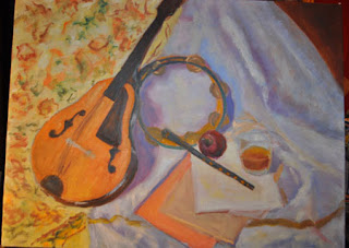
Welcome back! The remodeled music painting is progressing nicely. There is one change since Part 2, however. I had a revelation when I was painting and decided to switch my boring guitar with one a musical friend, Ron Anthony, designed and built. It is a beauty, with lots of detail and style. And it sounds great too! Of course, it doesn't hurt that Ron is an amazing musician, song writer, and singer.

As before, I'll walk you through paint mixing and application, still going from dark to light. For those who would like to know more about the drawing, I decided to include a mini lesson on perspective, using the tambourine.
I've included some information about color temperature, since I'm at the point where it's important for the harmony that the colors are mixed taking into account the temperature of the light on the subject.
There are wonderful books on art out there, so I've included a few of my favorites.

Going Thicker

In Part 2, I showed how I prepared the canvas and put in a thin coat of paint for all of the large shapes. This time, I'm beginning to use thicker paint, with no mineral spirits. I start with the darkest areas, which is the background, the tambourine and then the guitar and mandolin. I'm always working from dark to light, and thinking about where the light source is. I'm using a medium size bristle brush (#6) for the background and a medium size sable (#4) for the instruments. For smaller details, I use a sable round (#1).


For interest, I prefer a slightly turned view of all of the instruments, rather then a straight on view. I think it's more interesting and also, it helps to provide some depth.

I also started to add some shaping and color to the fabric, and strengthened the stripe that leads toward the tambourine.

Perspective Study of the Tambourine

The tambourine is a side view, making the shape more of an oval, The vanishing point (a point where parallel lines appear to converge) is off to the left, so to check the accuracy of the drawing, I first measure both the width and the height of the instrument using a pencil or my trusty measuring chopstick at arm's length. I put those measurements down, then I add my lines for the perspective, knowing that the vanishing point is off to the left.

I next put in vertical lines that are perpendicular to the perspective lines. To find the center, I draw a line from each corner within the square diagonally to the other. From here, I can draw an oval for the center negative space. I can measure the width of the inside and outside of the tambourine at the halfway point (see dotted line) and add those points.

This is a basic way to draw an ellipse. It works great for drawing things like tires on a car parked at an angle or any round shape that is viewed at an angle.

Mixing the Colors

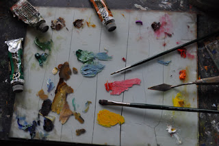
Here's my palette for this lesson. I've mixed my dark background black, then I'm using Transparent Oxide Yellow for the guitar and for parts of the mandolin, mixing with cadmium yellow and titanium white for the lighter tones. For the paisley fabric, cadmium red, orange, and yellow in various mixes. For the green, Chromium Oxide Green and some Viridian. I'm also using some of this mixed with a tiny amount of red (remember, mix with the complement to subdue the color and in this case, give it a warmer tone). Always check the temperature of your colors and their relationship to each other. If one of the colors is unintentionally standing out, it could be that the temperature is either too cool or too warm.

It's important to note that you can mix all of these colors using your basic complementary colors, so don't feel the need to rush out and buy them. Sometimes, when I order paint from Jerry's Artarama, they send me tubes of odd colors for free. That was the case for the Transparent Oxide Yellow. I normally would mix my own, but since I had it, why not use it?

I'm leaving the music paper for last, since it is the lightest area. The titanium white is too cool, so I will warm it up a bit.

Use Professional Artist Grade paint whenever possible. Student grade paint is full of fillers and has less pigment, making it harder to cover an area. The color is weaker and will also lose its color strength over time.

Why Color Temperature is Important

Local colors in a subject are influenced by the source of light, whether it is warm or cool. When approaching a subject, the first thing you should do is figure out whether your light source is warm or cool. If it's a bright sunny day, it would be warm, if it's cloudy, it would probably be cool. Indoor light can be either warm or cool, depending on the source. It the light is from a fluorescent light, it will most likely be cool. Once this is established, you should keep the temperature of your colors consistent throughout the painting.

In this painting, the source of light is a warm incandescent bulb, so when I mix my colors for my subjects, I'll know to use or mix warmer shades of each color. The shadows are different. We'll talk about how to do shadows in Part 4.

Words on Paper

Some of my favorite painting books are:

  • Alla Prima II by Richard Schmid
  • Carlson's Guide to Landscape Painting by John F. Carlson
  • Color Harmony in Your Paintings by Margaret Kessler
  • Landscape Painting by Mitchell Albala

Some great drawing books:

  • Drawing on the Right Side of the Brain by Betty Edwards
  • How to Draw What You See by Rudy De Reyna
  • Drawing for the Absolute Beginner by Mark and Mary Willenbrink


Next

In Part 4, I'm going to continue to work toward the lighter tones of the painting. I'l be paying attention to temperature and color harmony as I go. I'll tighten the details and drawings of the subjects and put in the music paper and pen. I'll also address folds, edges, and shadows. By the next email, the painting should be complete.

Use a palette knife to mix your paint on your palette. However, don’t be afraid of mixing some color on the canvas as you work. You may find some interesting results.

Thursday, April 23, 2020

Remodeling - Part 2


Welcome back! I hope that you are enjoying this step-by-step process of remodeling a painting. I find it challenging to revamp a painting, but to me, it's well worth the effort.

Preparing the Canvas

Now that I have a drawing, I'm ready to transfer the new design. But first, because there is paint on the canvas that might have some texture and my design has changed, I'd like to have a smooth surface to start with. To do this, I take a fine grade sanding sponge and lightly sand the surface that I will be changing. Some of the paint will come off and the surface will feel smooth once I'm done. Then, I take a paper towel and wipe off the excess dust from the paint.


Transferring the Design

Now, I'm ready to transfer my design. I decided that I would use vine charcoal to draw the design on the canvas. Vine charcoal will not show through paint later, and is easy to draw and correct. I taped the pencil drawing high up on my easel above the painting so that I can refer to it while I draw on the canvas. I don't bother to put in the shadows, just the outline of the design. As you can see, I added the guitar, moved the tambourine down, added the outline of the sheet music and the border for the fabric. I also added the fountain pen.

Start with Darks

Now it's time to mix my darks. I squeeze some Ultramarine Blue and Transparent Oxide Brown on the palette. I add some Rose Madder (I could also use Alizarin Crimson) and some Veridian. The mixture is about 80 percent blue and brown with a touch of rose madder and veridian green. I thin it out with a small amount of mineral spirits and begin to apply it where I want my darkest darks, which is mostly in the upper background.


Mixing the Colors

Next, I mix my greens for the tambourine, then the golden yellow for the guitar, the fabric, and the pen with a small amount of mineral spirits. I am only doing large shapes at this point, no details. I don't get too concerned with mixing the exact color nor do I worry if the drawing isn't exact. These will all be addressed as I proceed. I work my way through the whole painting like this, from dark to light, ending with the thinned out titanium white mixture for the sheet music.


 There’s no fear in oil painting! Be daring!

Final Block In

Here's the finished first coat. All of the paint was very thin but not runny. Wow, what a transformation! The original design is nothing more than a memory at this point!


References

I taped the drawing above my painting for a reference while I paint. It's important to have the drawing within view in case your design on the canvas goes astray.

I'll also have the instruments and other still life items set up nearby, if possible or have a photo reference, if not.


Next

I''m going to let this painting dry for a a day or two. In a few days, I'll post the next step in the process. I will not use mineral spirits at this point except to clean my brushes. I will also pay special attention to my color mixtures and to the color temperature. More on that later.

I hope you enjoyed Part 2 of Remodeling. Perhaps it will inspire you to pick up that brush and rework one of your paintings!

Tip: Draw, draw, draw first before you paint. Consider different compositions, move elements round, look at the values and ensure that you have a good balance of darks and lights, and get a feel for the design.

Friday, April 17, 2020


Remodeling Part 1

Greetings! I hope that you are safe and in good health.

I am like everyone else trying to keep busy, stay productive and remain healthy during this health crisis. All of my classes are on hold and there's no way to tell when they will start again. I know a lot of my students are anxious to get back to class and I do miss my students and teaching.
I am not much of a remote instructor. I enjoy hands on teaching and love the interaction with my students. However, that not being possible right now, I think a lot of you would be interested in how I go about planning and executing a painting.

Most of the time, I start a painting from the beginning with a drawing, canvas prepping, transferring of the design to canvas, and then I spend a few days painting and it's done. Sometimes, though, I revisit a painting that started out okay, but then suddenly stopped dead in its tracks. Usually, I am not happy with the direction it's going and rather then go raging mad and rip the canvas apart like Cezanne often did (though I admit occasionally the thought does occur to me!), I set the painting aside and look at it now and then. I think about how I can modify and improve it. I call it "Remodeling," though I don't use a sledge hammer.

By the way, if you haven't seen the Netflix movie, Cezanne et moi, about the friendship of Paul Cezanne and Emile Zola, I highly recommend it! You can find it on Netflix.

But I digress. I started this painting about three years ago, and was unsatisfied with some parts of it, so I have been pondering over it ever since. I'm now ready to tackle it with a fresh new perspective. I thought that some of you might be interested in how I rework a painting, so I'm going to post the original artwork for this first post, and I'm going to show you how I'm planning to change it. I will send out additional emails that will show the steps that I take and will tell you the reasons for my steps.

Here it is:


The Drawing

The first step is to start with a brand-new drawing. I had some drawing paper that was the exact size of the canvas, which helped. I began working on a new design using a soft pencil and a kneaded eraser. I decided that I liked the mandolin and tambourine, so they will continue to be part of the setup. I liked the colorful fabric because it gave an interesting texture to the design but I didn't care for the white fabric and felt the small objects were lost in the design, so I discarded these. I re-positioned the tambourine and added the guitar, sheet music, and pen. The background will be very dark except toward the bottom where the fabric will be reintroduced.

It's important to note that my drawing is not just a line drawing, but also includes the dark and light areas (values) which I believe are critical to the design. If there's a nice balance of contrast, the picture will be more pleasing. This design shows a good mix of light, medium and dark values. The position of the items is also important. The eye should always be "invited" into the picture like a welcome guest and "asked to stay."


In a few days, I'll post the next step in the process. So sit back and relax. I hope you enjoy this free instruction. Perhaps it will inspire you to pick up that brush and paint a masterpiece!

Tip: Measure as you go, check accuracy by turning the canvas upside down and/or use a mirror.

Another Kind of Remodeling

Finally, I managed to get past some of the problems that prevented me from rebuilding my website. I'm happy to say that the new site is up and running. You can now view it from a computer or mobile device. I have a new Art Instruction page and a new Contact page. The dates for instruction and exhibitions are not current since I designed it before the pandemic shut things down, but I will update it when I have good dates.

I'm hoping that classes resume in late spring, but if they don't, I will be offering the same classes in painting and drawing this fall at Hamden Adult Ed, and Wallingford Adult Ed. I hope to offer classes this summer at Artsplace and continue with painting classes at the North Haven Senior Center. Stay tuned for updates.


There’s no such thing as talent. Good art takes a lot of work, a lot of hours, and a lot of patience. A good artist has earned his way.